
Joseph Albers abstract work. looks at colour theory, illusions and shape.
Accomplished as a designer, photographer, typographer, printmaker, and poet, Albers is best remembered
for his work as an abstract painter and theorist. He favoured a very
disciplined approach to composition. Most famous of all are the
hundreds of paintings and prints that make up the series, Homage to the Square.
In this rigorous series, begun in 1949, Albers explored chromatic
interactions with nested squares. Usually painting on Masonite, he used a palette knife with oil colours and
often recorded the colours he used on the back of his works. Each painting
consists of either three or four squares of solid planes of colour nested within
one another, in one of four different arrangements and in square formats ranging
from 406×406 mm to 1.22×1.22 m.

Kazimir Malevich.
Kazimir Malevich used supremitism he created a series of work of black and white squares.
Malevich exhibited his first Black
Square, now at the Tretyakov
Gallery in Moscow, at
the Last Futurist Exhibition 0,10 in Petrograd in
1915. A black square
placed against the sun appeared for the first time in the 1913 scenery designs
for the Futurist opera Victory over the Sun. The second Black
Square was painted around 1923. Some believe that the
third Black
Square (also at the Tretyakov Gallery) was painted in
1929 for Malevich's solo exhibition, because of the poor condition of the 1915
square

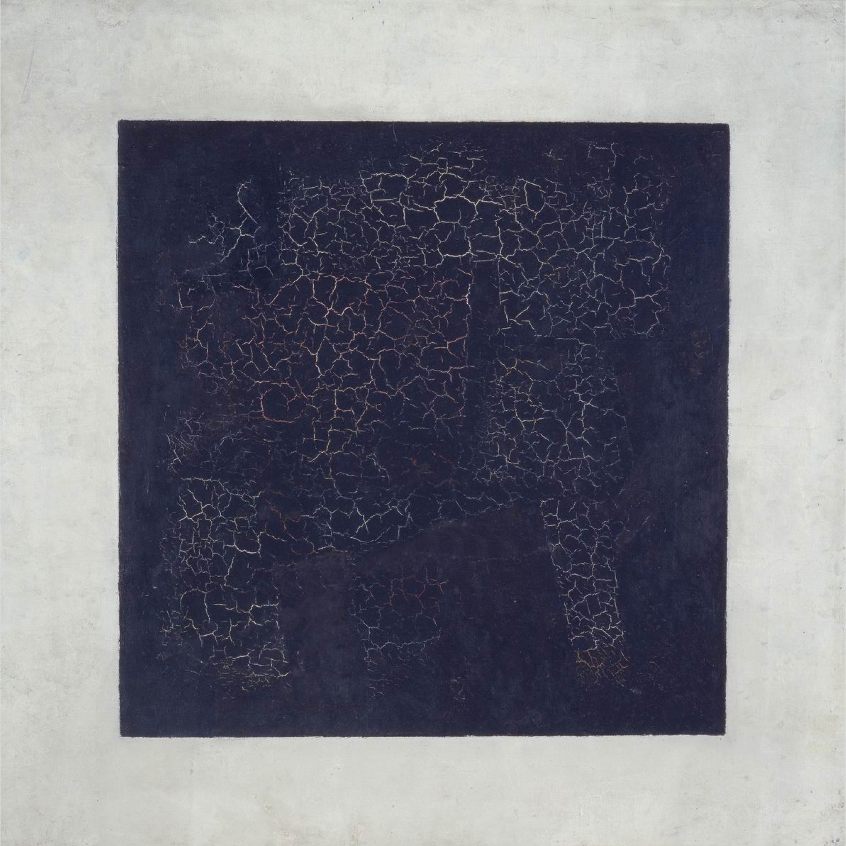
In my opinion the work of Kazimir Malevich looks quite old fashioned because as it is cracked reminds me of architectural ruins. In contrast the work of Joseph Albers appears
more modern and could be part of grafic design work or interior design today.

Albers work as a reference. Although i like his visual style i think the work was too simple and wanted to use the shape of he cross as guide to create a design that featured more colours.

the way in which I related my own work to Malevich was through using his black and white pallet and playing with borders. I decided to reverse his usual choice of black on white to experiment with white on black, the reason I decided to do this was to determine if this would work visually. I think that the outcome has characteristics of an illusion, certain squares appear closer than others.
work in progress
No comments:
Post a Comment